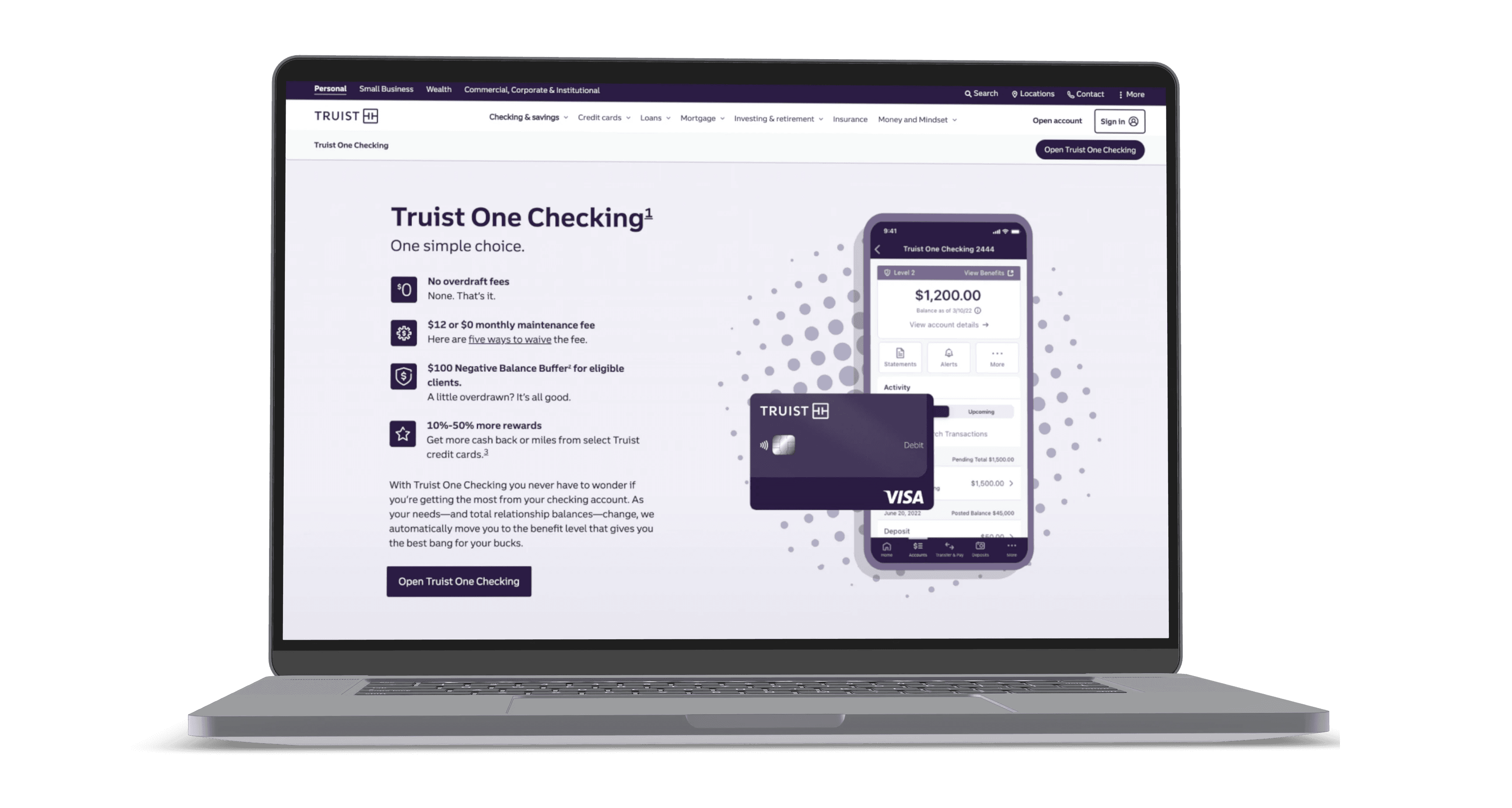
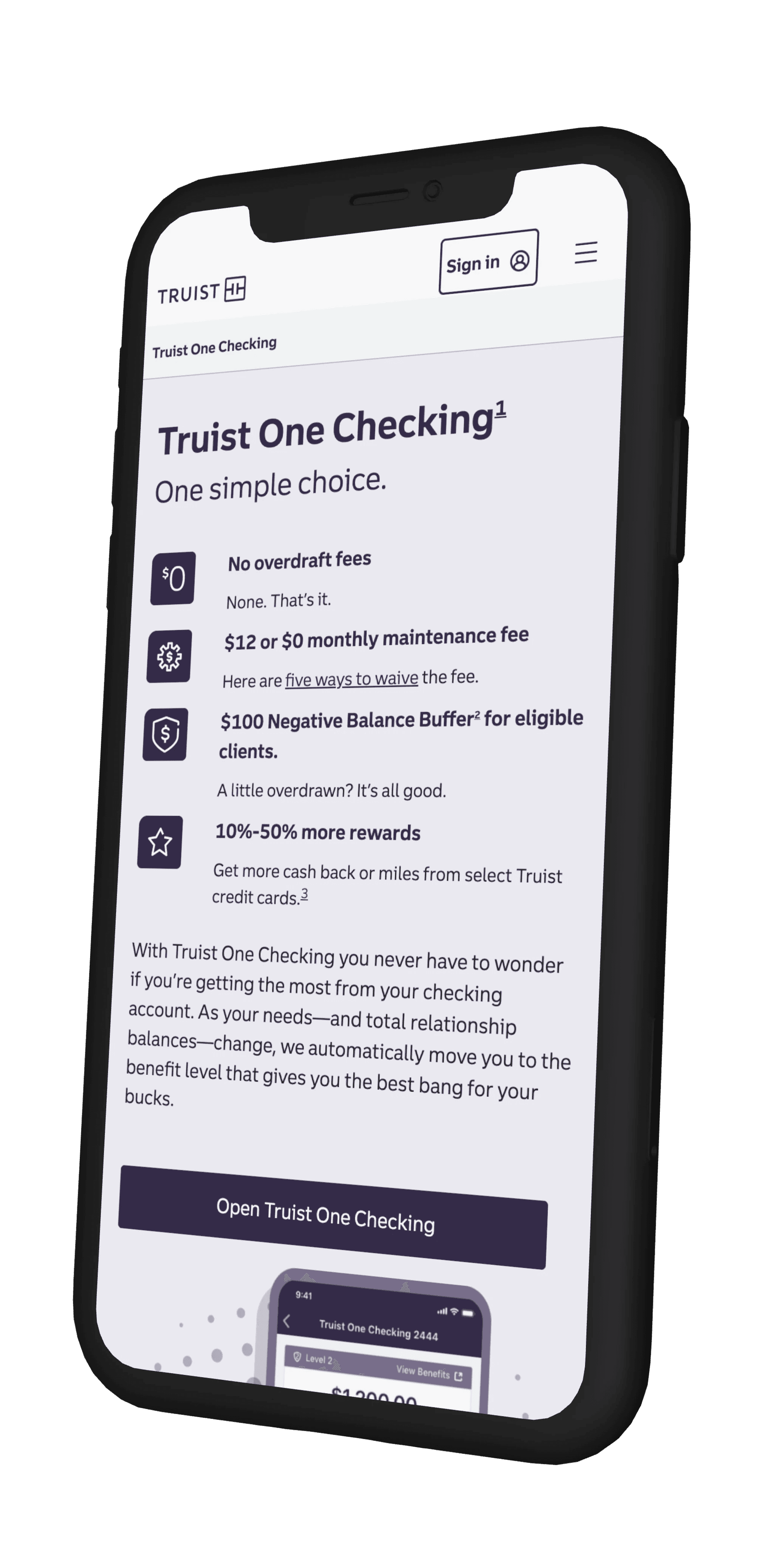
Problem
Design a Retail Banking page that promotes the new Truist One Checking product. The product allows users to move between five different benefit levels based on their cumulative sum of balances across all of their Retail Banking accounts. (early 2022)
KPIs
App starts and completes and traffic compared to original checking products. Measured in Adobe Analytics.
Customer feedback from Qualtrics
Post-launch research and user testing
Timeline
Approximately 4 months for us to complete research (including interviews, surveys and user testing), design and development before the product launch.
This began with a kickoff with the stakeholders and delivery team. After we established milestones per phase of the work, I conducted a competitive analysis paired with design inspiration findings. I then moved into rapid prototyping to prepare for user testing in collaboration with our content team. We then presented the research findings and design mockups to stakeholders to combine their insights with user feedback. With stakeholder and user feedback, we were able to finalize the designs and prepare and export all visual assets for our developers to use in authoring. Before the work went live, I reviewed the page in AEM to ensure they align with my original designs.
See the live experience here.
Complexity of benefit levels could turn customers away from opening an account
Users had difficulty understanding particular terminology, such as "negative balance buffer"
Users did not understand that the balance that would determine which benefit level they would fall in was based on the cumulative balance of their other Truist bank accounts.
Next steps for 2023:
Truist One Checking is currently underoing another redesign based on user feedback that they are having a difficult time understanding the benefit levels and particular vocabulary. We are also continuing to monitor Adobe Analytics and survey feedback in Qualtrics to note further improvements to make in the experience.

